
No People, High Impact: Design a High‑Converting Brand Without Faces
Most websites lean heavily on people images to build trust—yet those photos can feel generic or even distracting. If your brand prefers no people images, crafting a high-converting site might seem tricky at first. This post lays out clear ways to use B2B brand visuals like abstract imagery, iconography systems, and product UI screenshots to create powerful, privacy-friendly designs that turn visitors into leads. Ready to rethink your homepage hero design without faces? Learn more.
Crafting No-People Visuals

Creating a website without people images can seem daunting, yet it opens doors to innovative designs. By using unique visuals, you not only stand out but also connect with your audience in fresh ways.
Benefits of Abstract Imagery
Abstract imagery offers a versatile approach to visual storytelling. It allows you to convey complex ideas without the clutter of traditional images. Think about vibrant patterns or sleek, geometric designs. These images can evoke emotions, set moods, and attract attention. For example, a simple swirl of colors can represent creativity or innovation. Abstract visuals give you the flexibility to align with your brand’s tone and message, helping you create a memorable impression.
Building a Brand Pattern Library
A brand pattern library serves as a toolkit for consistency. By developing a set of unique patterns, you ensure your brand remains recognizable across all platforms. These patterns become your brand’s signature, much like a logo. They can be used on your website, social media, and marketing materials. Start small with a few designs and expand as needed. This approach not only streamlines your design process but also strengthens your brand identity.
Stock Photo Alternatives Explored
Finding substitutes for stock photos is easier than you think. Consider using illustrations, icons, and even typography. These elements can add personality and uniqueness to your visuals. Illustrations can tell your brand story in a way that photos cannot. Icons can simplify complex concepts into digestible visuals. Typography, when used creatively, can convey emotions and messages effectively. Exploring these alternatives allows you to craft a brand image that resonates with your audience without relying on traditional stock photos.
Designing Without Faces

Once you’ve embraced abstract and alternative imagery, it’s crucial to understand how to apply these elements effectively. Designing without faces requires a strategic approach to ensure your visuals retain impact.
Iconography System Essentials
Icons are powerful tools for communication. A well-designed iconography system can guide users, highlight features, and enhance understanding. When designing icons, focus on simplicity and clarity. Each icon should convey its meaning at a glance. Consistent style and color scheme are vital to maintaining cohesion. Consider using SVG icons for scalability and crispness across devices. An effective iconography system not only aids navigation but also reinforces brand recognition.
Product UI Screenshots as Visuals
Product UI screenshots offer a direct glimpse into your offerings. They provide transparency and build trust by showing your product in action. Use screenshots to highlight key features and benefits. Ensure they are clean, focused, and accompanied by concise captions. This approach gives potential clients a real sense of what to expect, helping them make informed decisions. High-quality UI images can be more persuasive than any descriptive text.
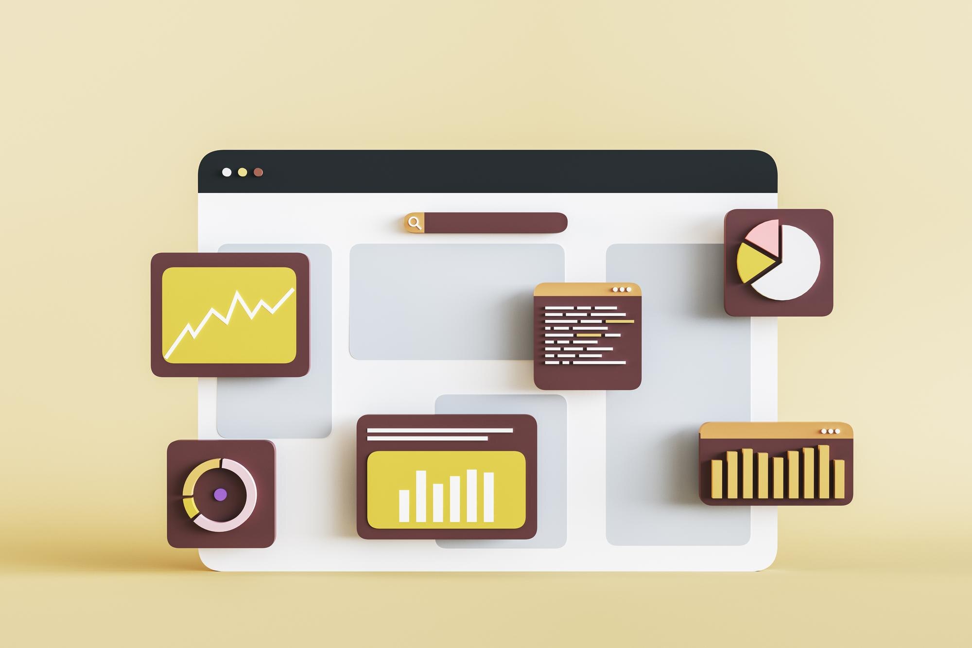
Data Visualization Graphics for Impact
Data visualization transforms complex information into easy-to-understand graphics. Charts, graphs, and infographics can illustrate trends, comparisons, and insights effectively. Use bold colors and clear labels to make data pop. Each graphic should tell a story and guide the viewer through the information. Data visualizations not only enhance comprehension but also add credibility to your content. When executed well, these graphics can be a game-changer in conveying your message.
Enhancing Website Performance
Crafting visuals is only part of the equation. To truly succeed, your website must perform at its best. Let’s explore how to optimize for conversions and user experience.
Conversion Rate Optimization Tips
Boosting conversions is about removing friction. Ensure your call-to-action buttons are prominent and compelling. Use contrasting colors to make them stand out. Simplify forms by reducing the number of fields. Highlight testimonials or social proof to build trust. Each element on your page should guide visitors toward taking action. Remember, the goal is to make the path to conversion as clear and inviting as possible.
Accessibility in Imagery Strategies
Accessibility is key to inclusivity. Ensure your visuals cater to all users by incorporating alt text for images and using high-contrast colors. Make sure your fonts are readable and scalable. Consider those with visual impairments by providing text alternatives and ensuring navigability with screen readers. By prioritizing accessibility, you not only comply with standards but also expand your reach to a broader audience.
Privacy-Friendly Visuals Explained
In today’s digital landscape, privacy is a major concern. Choosing visuals that respect user privacy can set you apart. Avoid using images that require user consent, such as personal photos. Instead, opt for graphics that convey your message without needing sensitive data. Privacy-friendly visuals build trust and show your audience that you value their personal space. This approach not only protects your brand but also fosters a positive relationship with your customers.
These strategies demonstrate that engaging website design is possible without people images. By focusing on abstract visuals, iconography, and data-driven graphics, you can create a dynamic online presence. Ready to transform your brand’s digital experience? Let your visuals speak volumes without saying a word.